Sydney Review of Books - Generative tiles
For the Sydney Review of Books we built a flexible branding tool to create thousands of unique, pattern-based images to accompany their library of essays, reviews, articles, and interviews.
Alongside the new website we built for the SRB, we created a brand system tool which would automatically output a pattern-based image for every piece of content in their archive, suffusing their site with a fluid, highly recognisable, and unique identity.
High level overview
SRB is an organisation that has a great archive of content featuring thousands of evergreen articles with more work published weekly. But they did not want to have to source or create high quality images for each new literary essay that they published. They needed a design system - a way of creating visual content that was reliably on brand but with enough capacity for variation that each image would be visually interesting both individually and as part of a whole.
How does it work
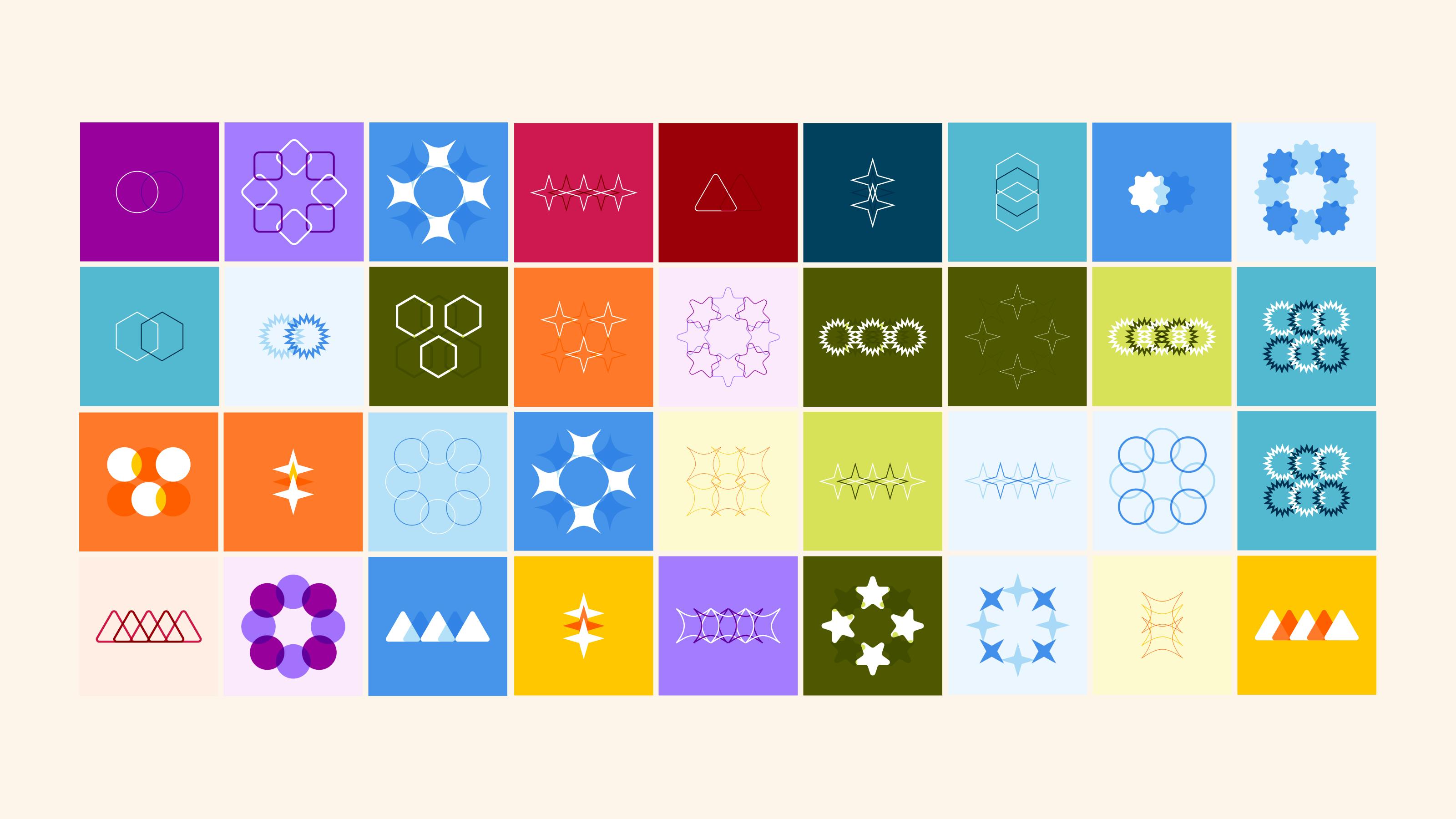
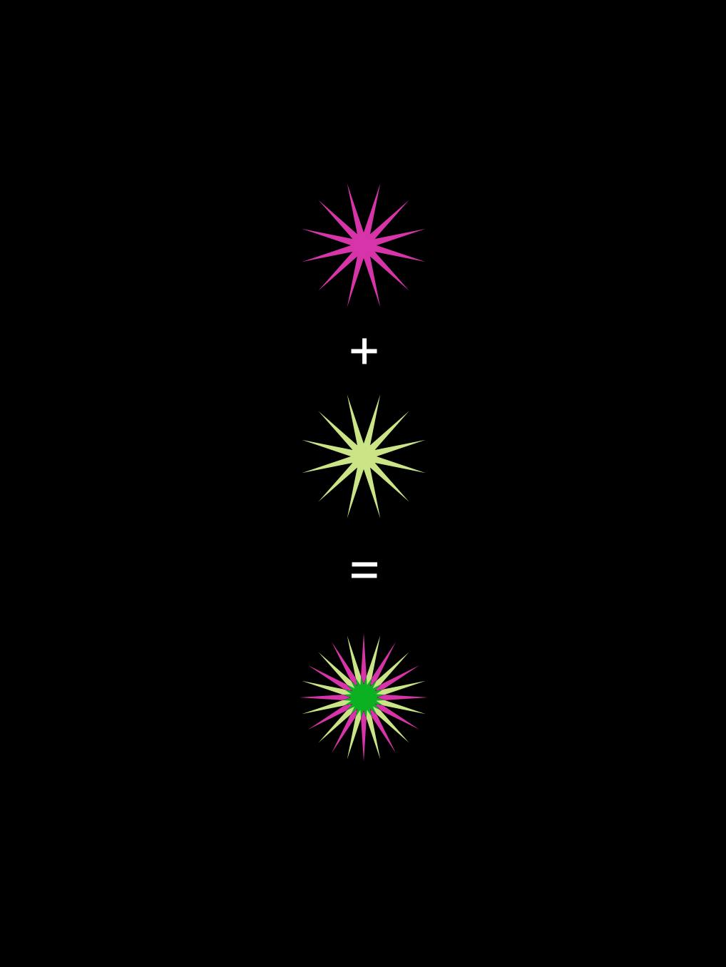
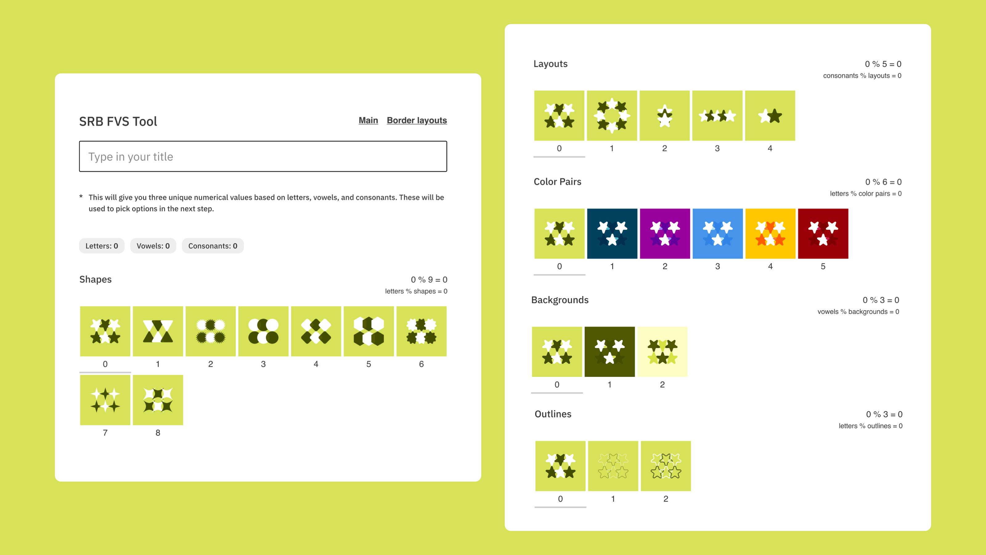
The tool that we built is simple, each image is a random combination of a curated selection of geometric shapes, colour sets, and css layouts.
This simplicity is intentional. To quote Will Mclean:
“We believe that a system need not be complex to be effective. In fact, the more complex it is, the more difficult it is to maintain, and the harder it is to collaborate with others on the design.
In this system we stayed simple. Shapes are simple. They are easy for everyone to understand. Five layouts are simple. We can all understand three shapes in a row, or eight shapes in a circle pattern. The same can be said for all the other variations. The magic happens when we begin to combine them: the simple system reveals itself to be sophisticated.
The fact that SRB readers can decipher the system if they want to is a beautiful thing. It helps people connect with the brand and remember the design principles.”
Why is it good
The tool is directly integrated into the SRB site, using the unique combination of each article’s title elements (the character count, vowel count, and consonant count) a random combination of the base elements is concocted. The SRB team doesn't need to lift a finger and every piece of content that they publish will automatically be assigned a unique and branded image.
The system's inherent flexibility and adaptability are arguably its most valuable features. While the foundational identity remains constant and recognizable, there is scope for expansion and refinement, including the introduction of additional shapes, alternative layouts, and new colour combinations.
Read more about this tool on the SRB website, in Will Mclean’s full blog post about this tool and Flexible Design Systems.
Get in touch and we can provide a link to the tool.
Credits & Related Content
Clients:
Partners:
Products:

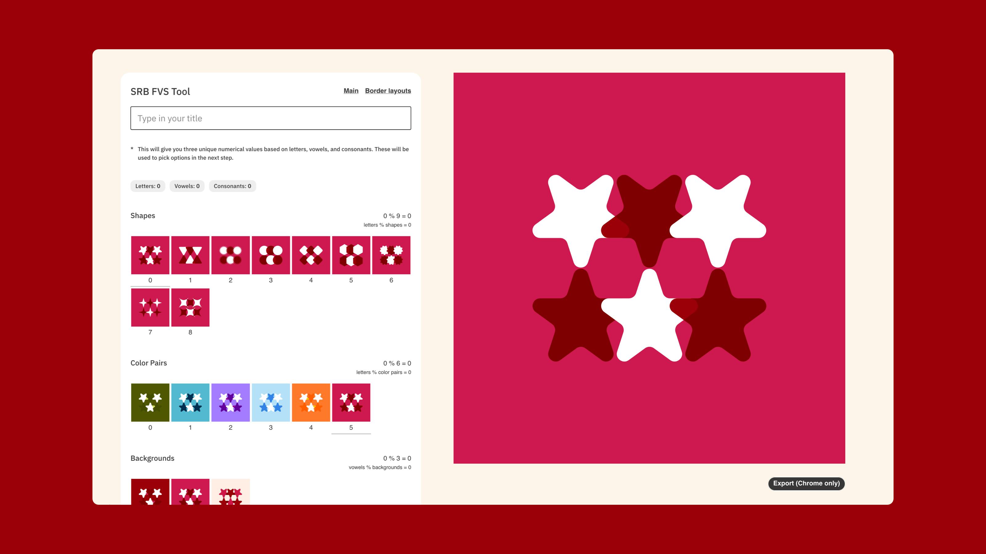
The tool interface. A text box that allows you to write your title to auto-generate your tile. This matched what is generated automatically within the CMS.
If you are unhappy with the auto-generation then you can select variations manually, decide on what you like then apply those variations inside the CMS.
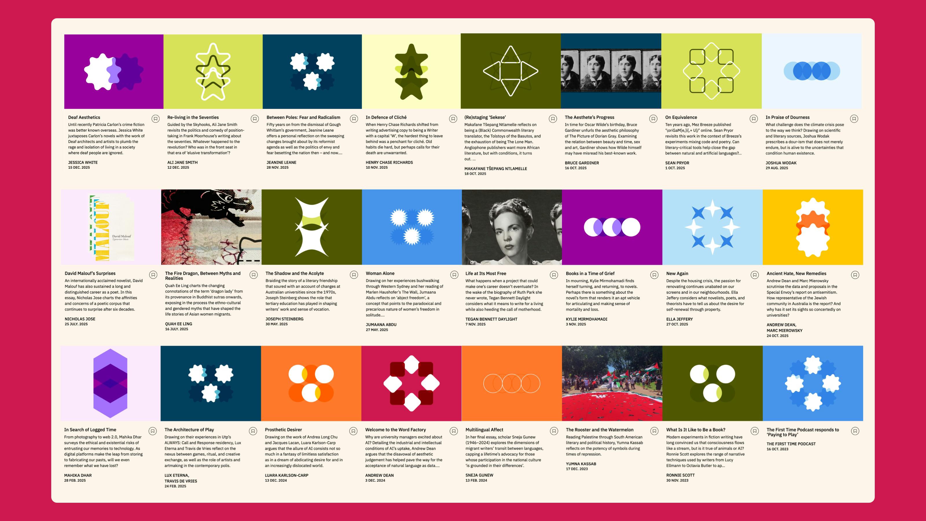
The tiles interspersed throughout the site.

At the heart of the system are five simple layouts
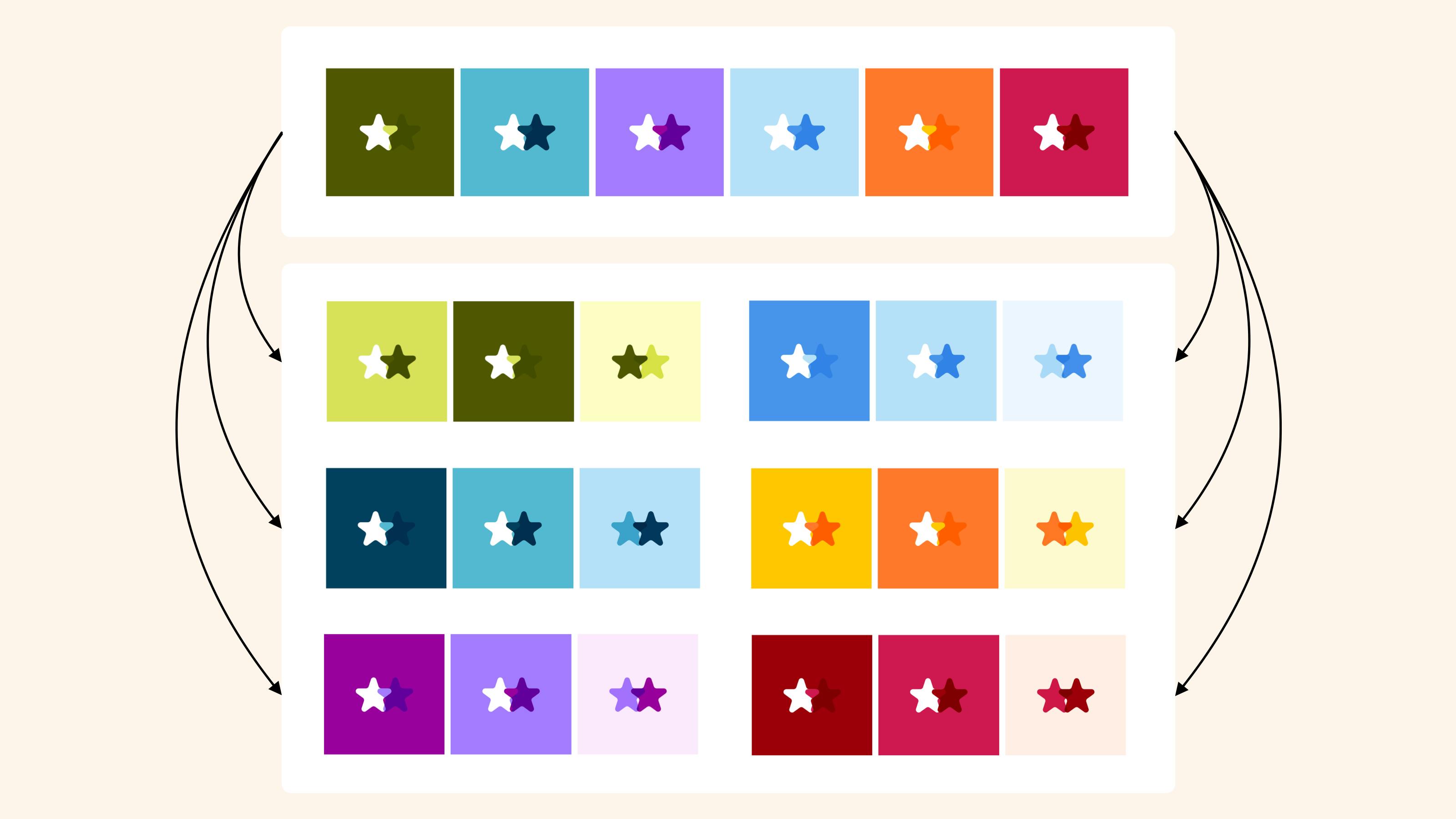
Each colour set has three colours. Changing how those colours are applied to the shapes gives 18 different palettes.